Tennisman by day, equilibrist by night
Driven by a desire to gain in desirability and enhance its image, the iconic brand called on Seenk to better promote its positioning halfway between sportswear and French elegance.
Sport-chic once, sport-chic always
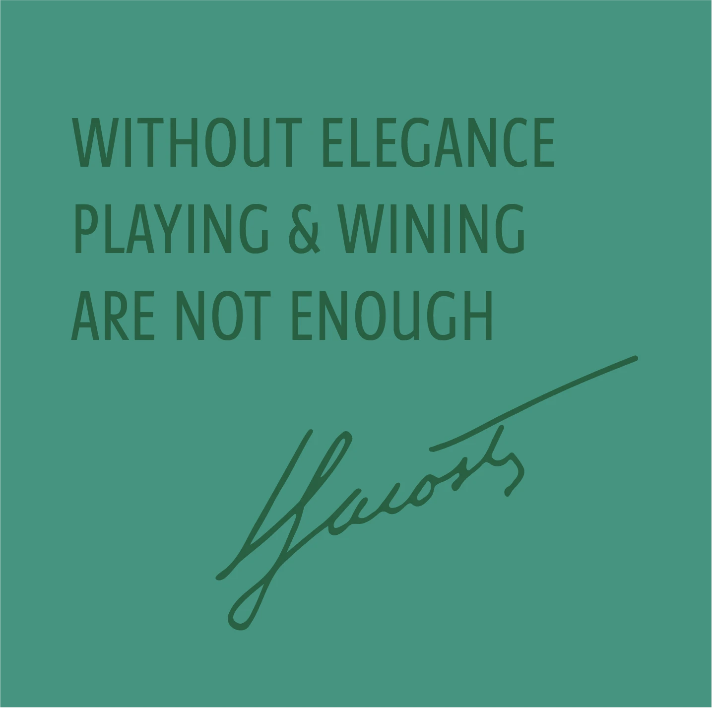
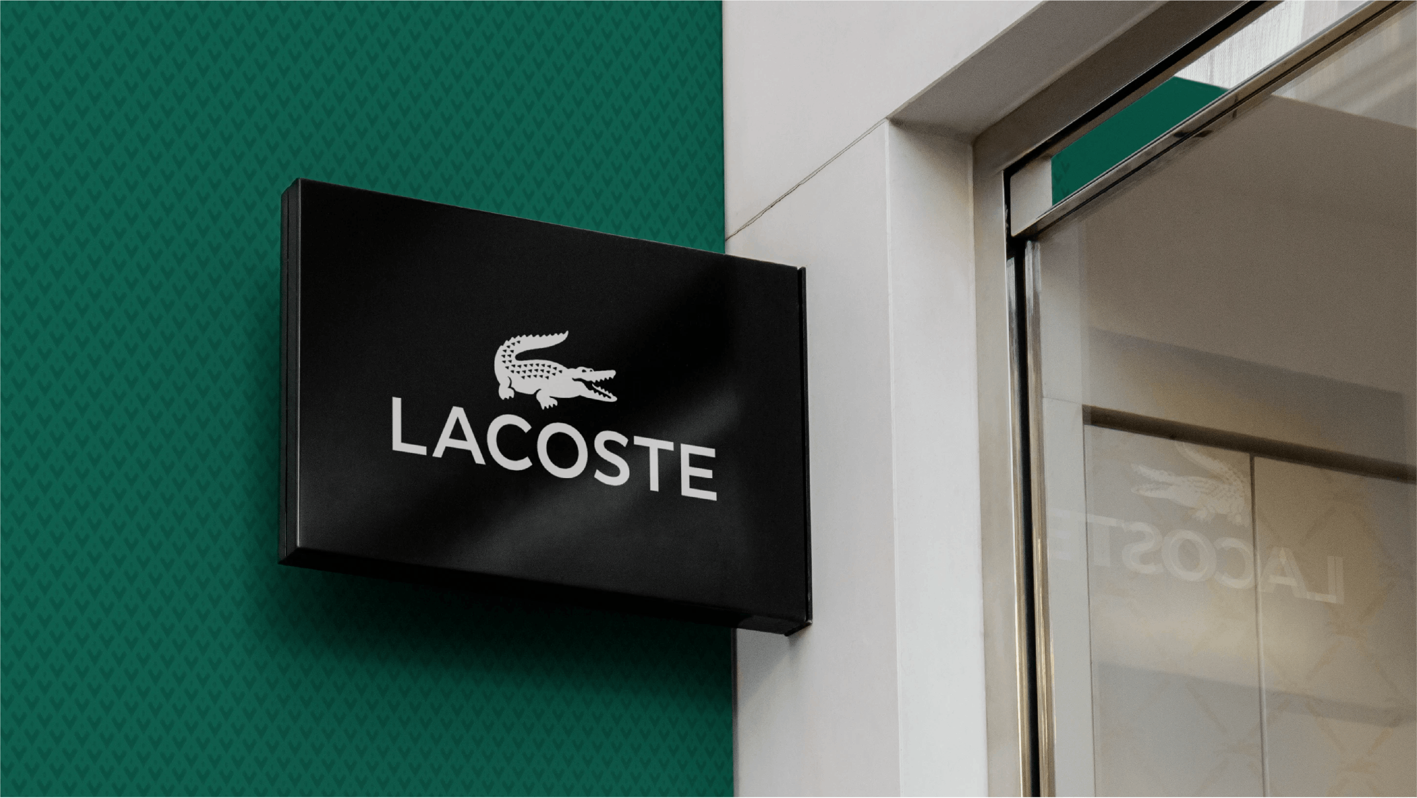
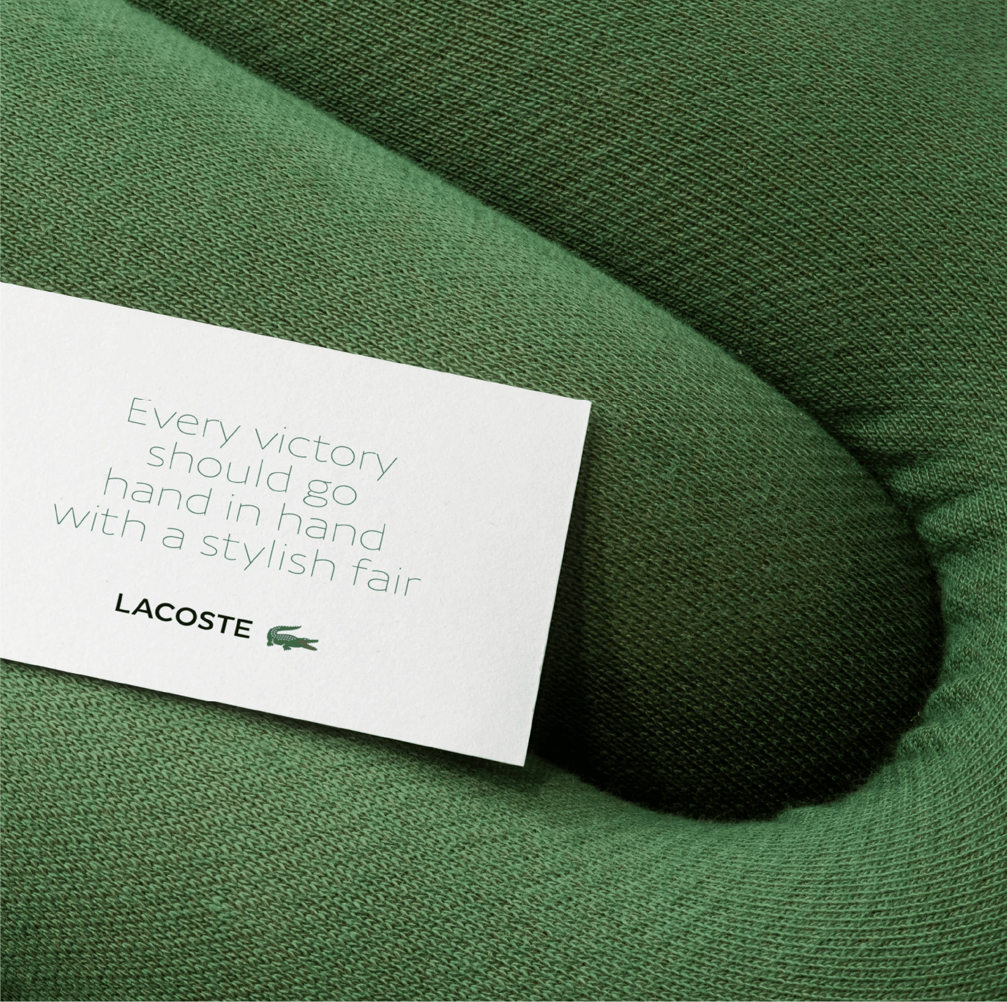
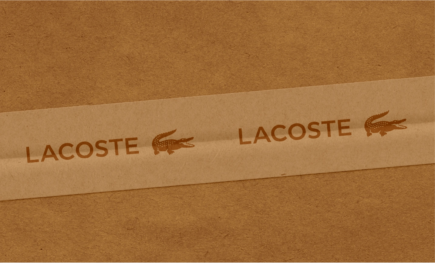
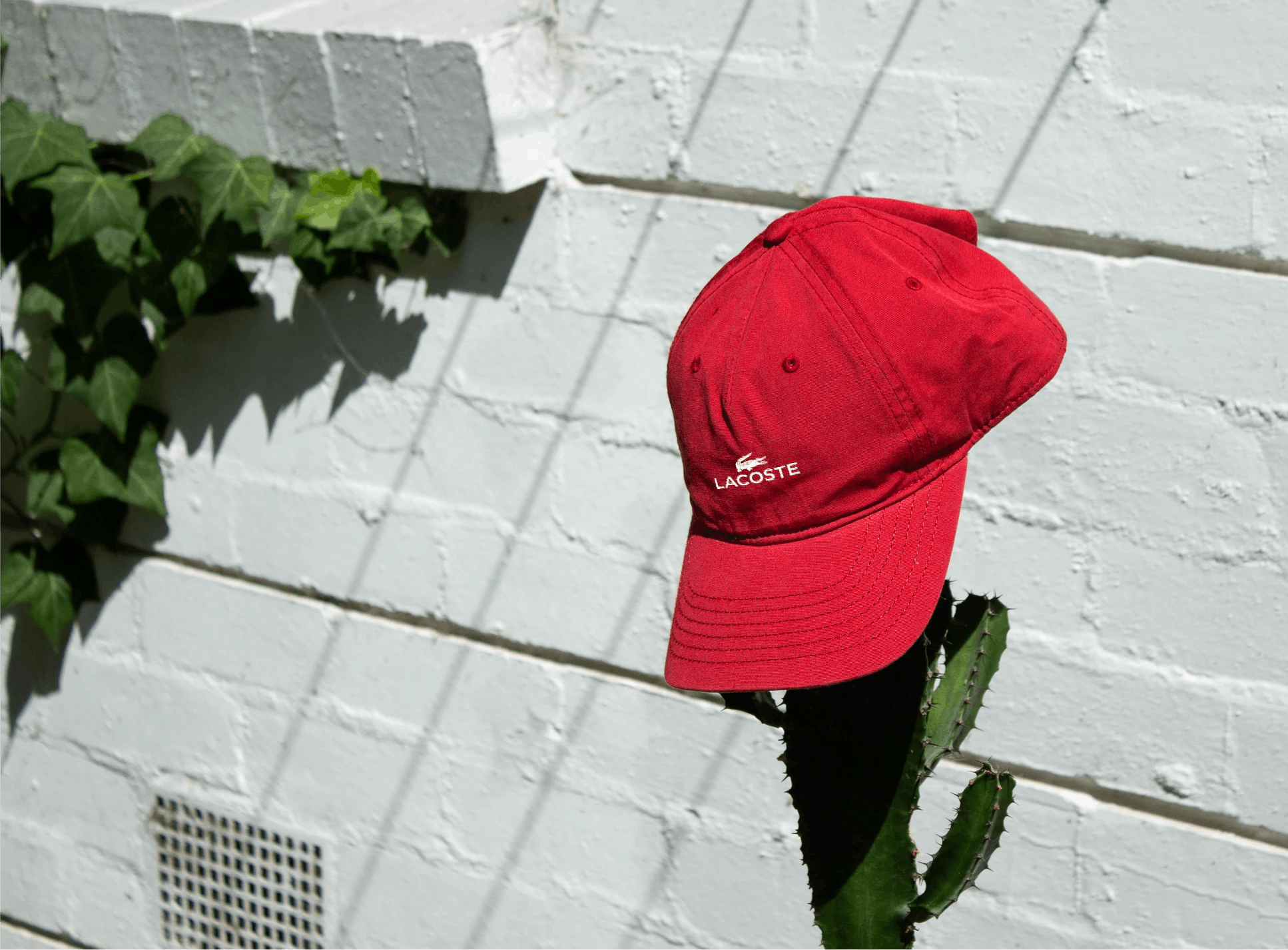
Lacoste is the story of an eternal tension between a powerful racquet stroke and a style imbued with lightness, an offensive crocodile and gracefully tailored polo shirts. Seenk evolves the brand symbol with a more sober treatment and creates 3 new typographies to reconcile the sporting heritage on the one hand with the subtle style of the founding fathers on the other.

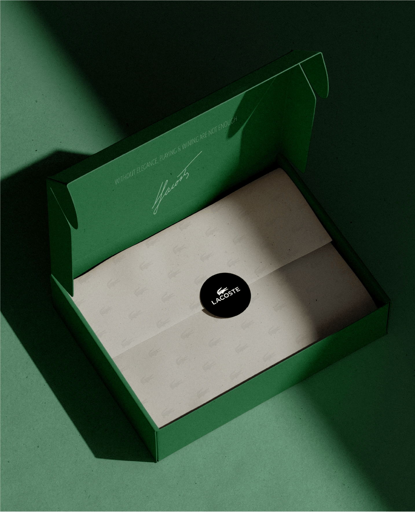
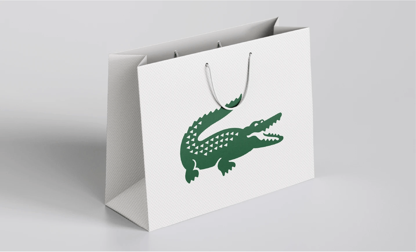
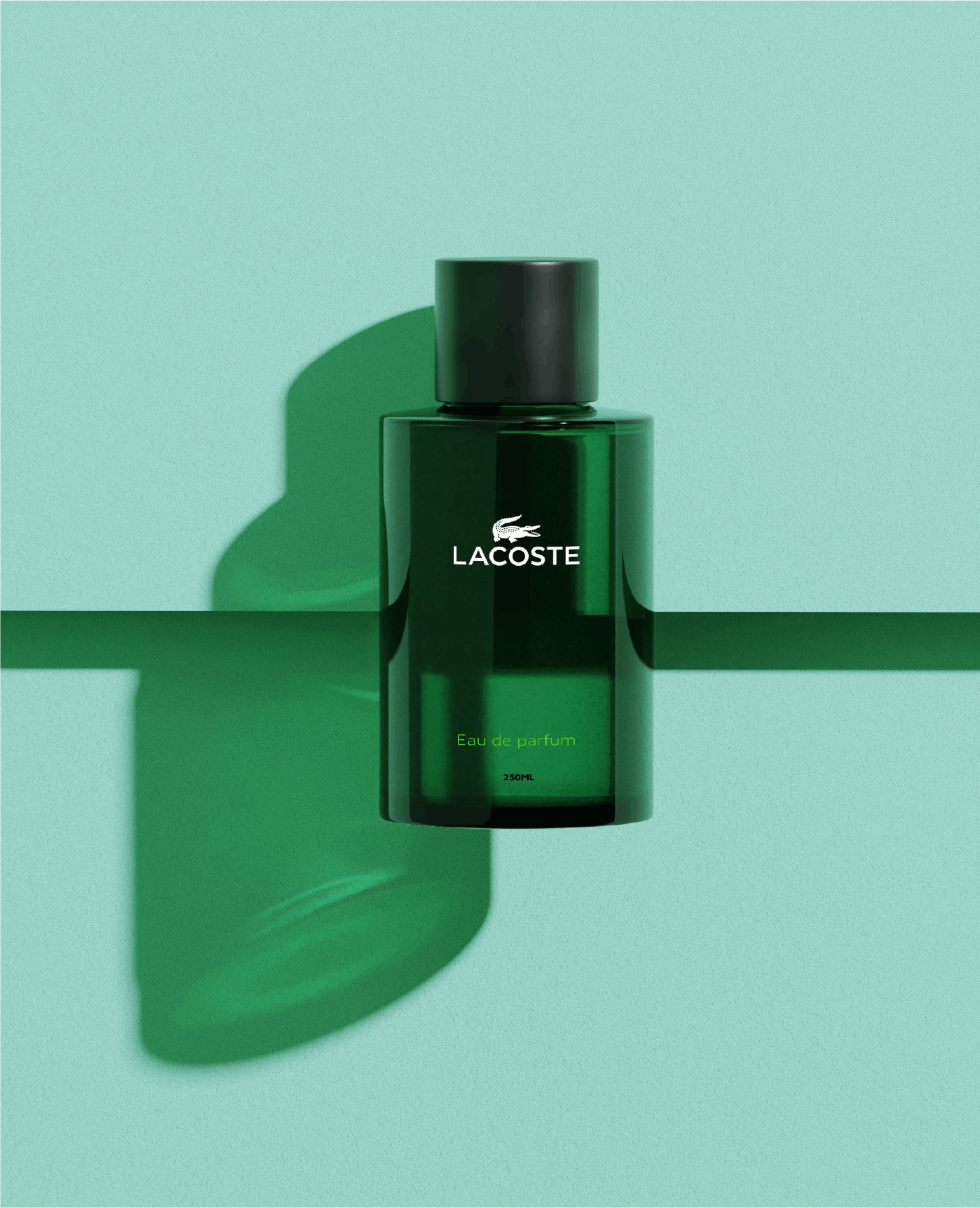
Dandy crocodile
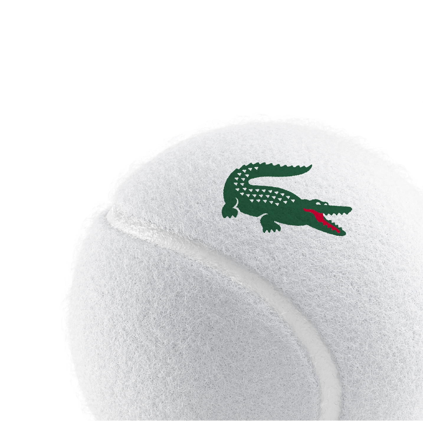
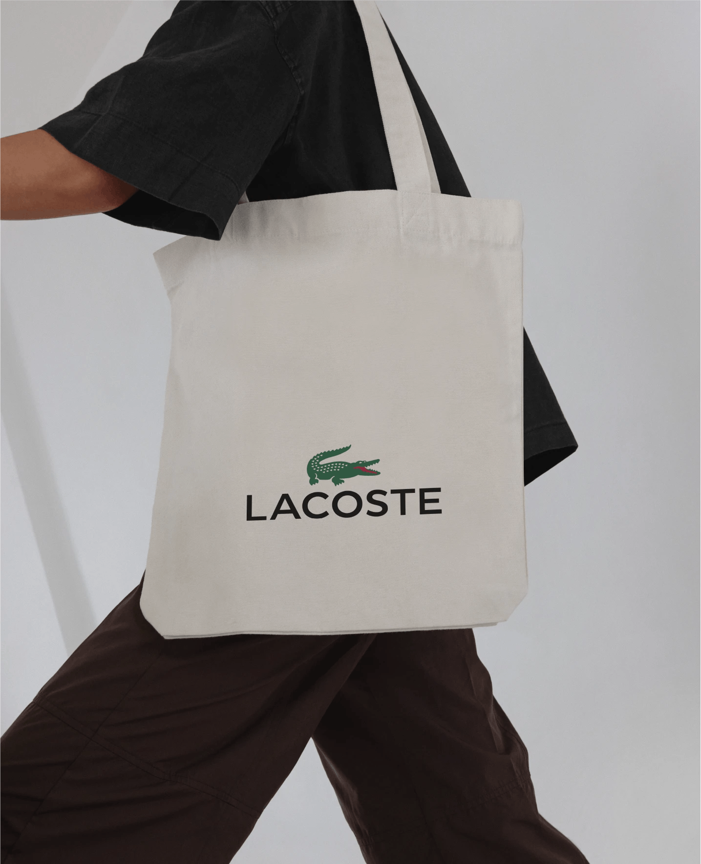
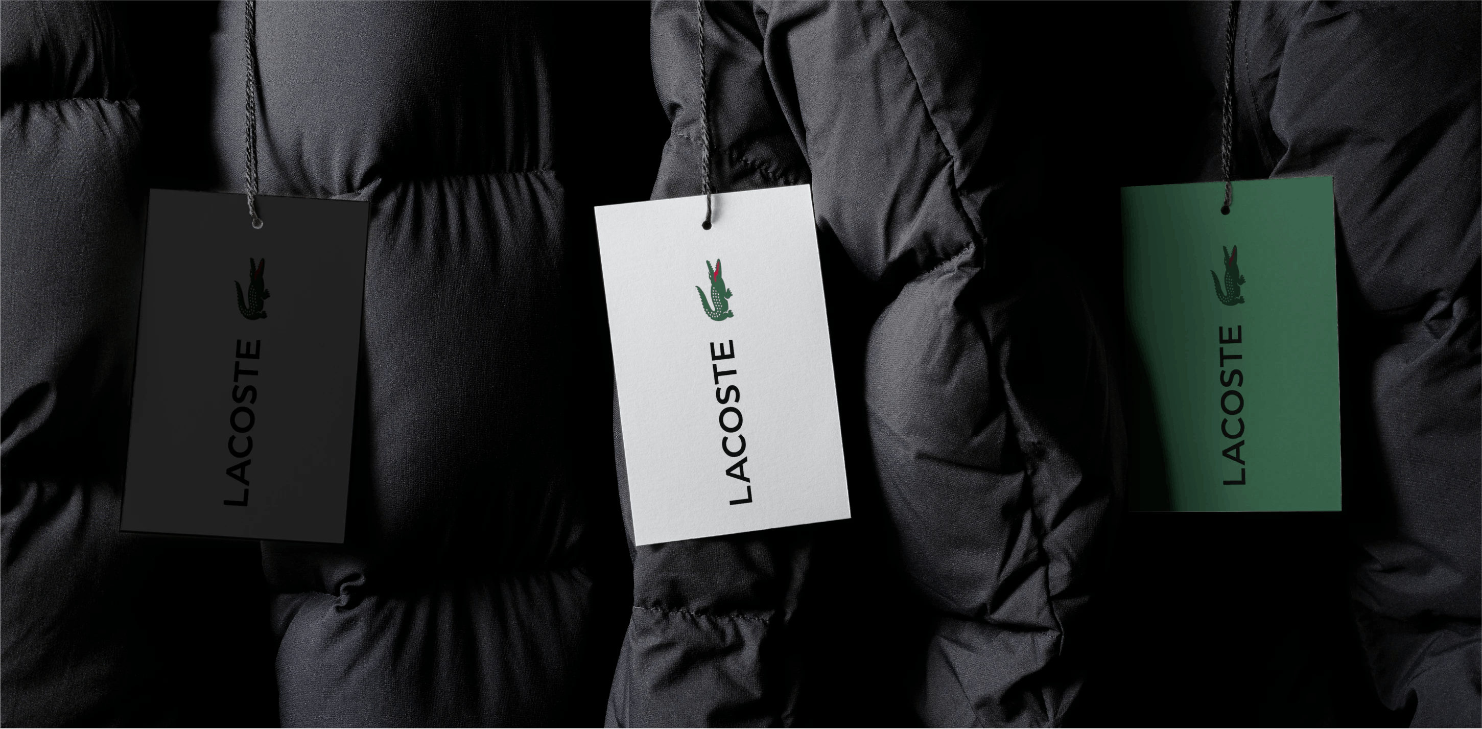
The crocodile adopts an antique treatment, finer and more elegant. This design echoes the typographic codes of fashion brands and has also enabled Lacoste to expand into the perfume and leather goods segments. Its supple, unstructured curves have been harmonized, reducing its figurativeness to give it the nobility of a heraldic emblem. A horizontal structure has also been introduced to reduce the sense of status.
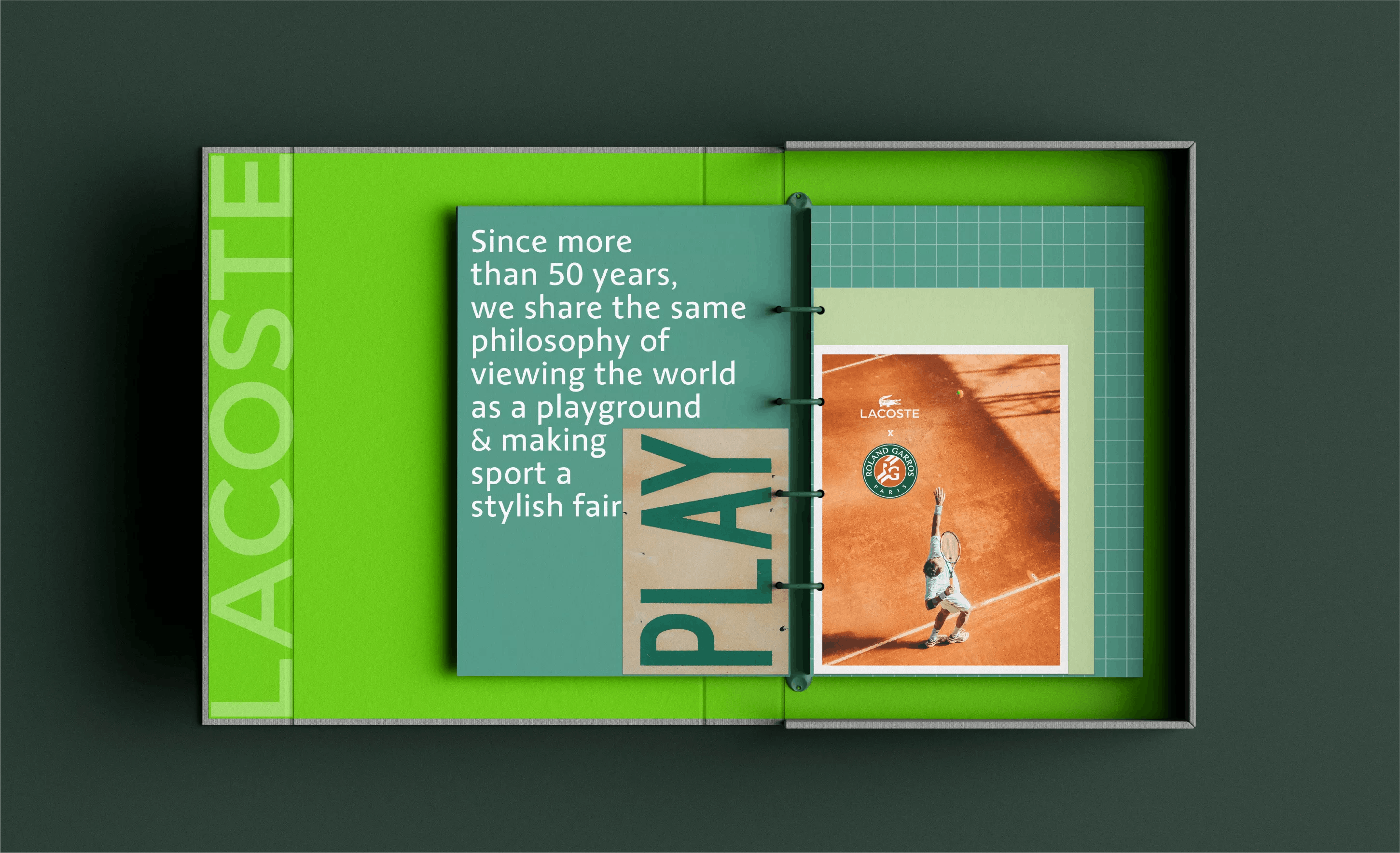
Spreading the heritage
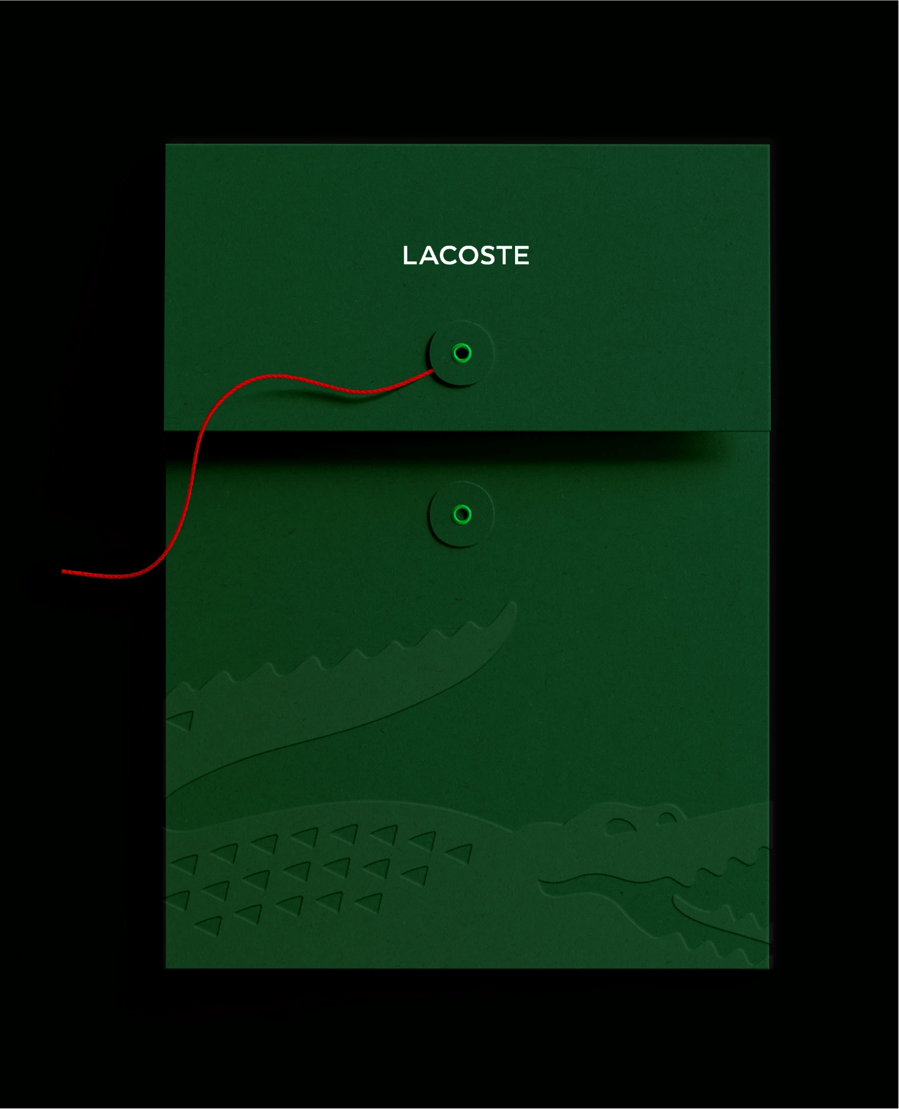
To enable Lacoste to best express its history, Seenk formalizes the brand platform, designs and produces a brand guide for employees and partners, and produces brand films to disseminate this singular brand heritage.

Campaign created by BETC