BNP Paribas

Topcom
Gold and Jury’s Special Prize in Design
The brand of a changing world
More than 15 years after helping to lay the foundations of BNP Paribas’s identity, Seenk set the leading European bank in motion. A new playing field that addresses all its communication themes, brings its digital presence to life, and lets its positioning resonate once again.
A revitalized momentum
From a static symbol that carried the idea of movement, a dynamic brand was born. The “takeoff curve” in the logo becomes a central element in the brand’s expression. From this curve, the swallow also takes flight, embodying a second strong symbol. Both adopt various treatments and materials to address all the brand’s affinity topics, such as its commitment to cinema and its historic partnership with Roland-Garros.


Iconic.
In motion.
These two animated symbols create a seamless, modern brand experience. They ensure BNP Paribas is instantly recognizable and has maximum impact, even on formats as small as an Instagram post. In motion, these codes give new resonance to “The bank for a changing world” in the era of screens.


Our other projects
SAFRAN
DS Restauration
Lacoste
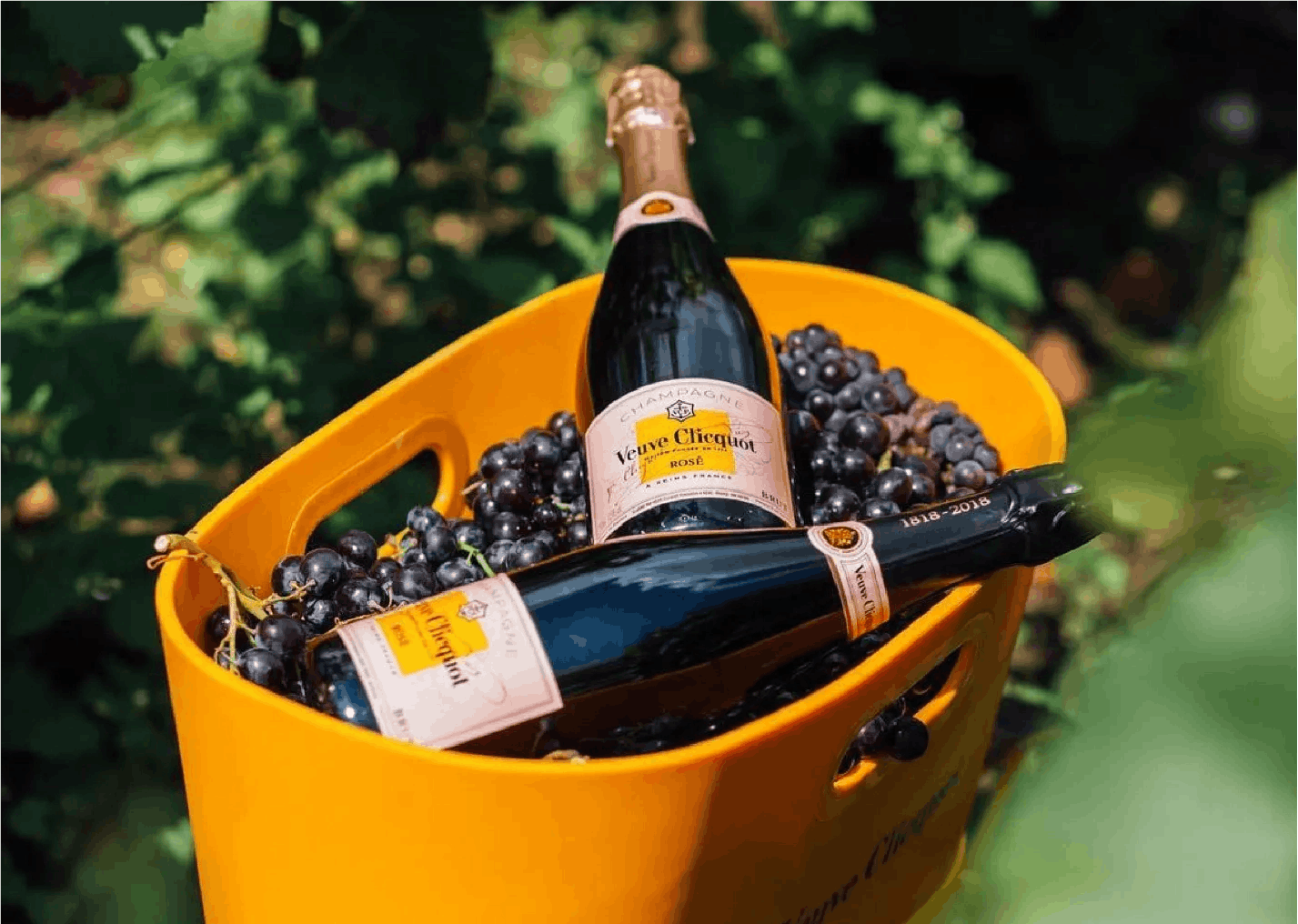
Veuve Clicquot
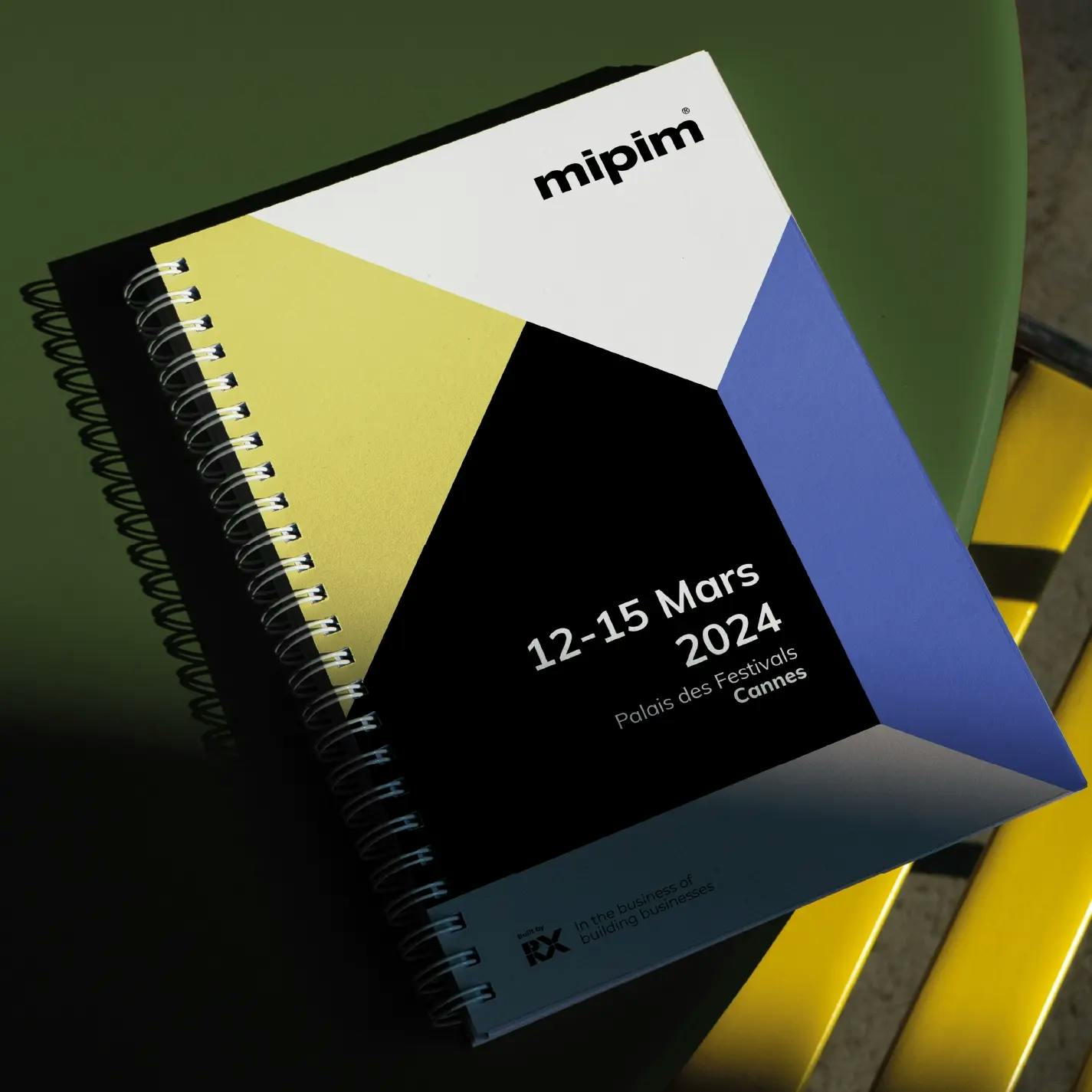
Mipim
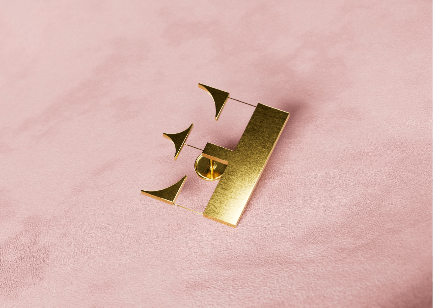
EquipHotel
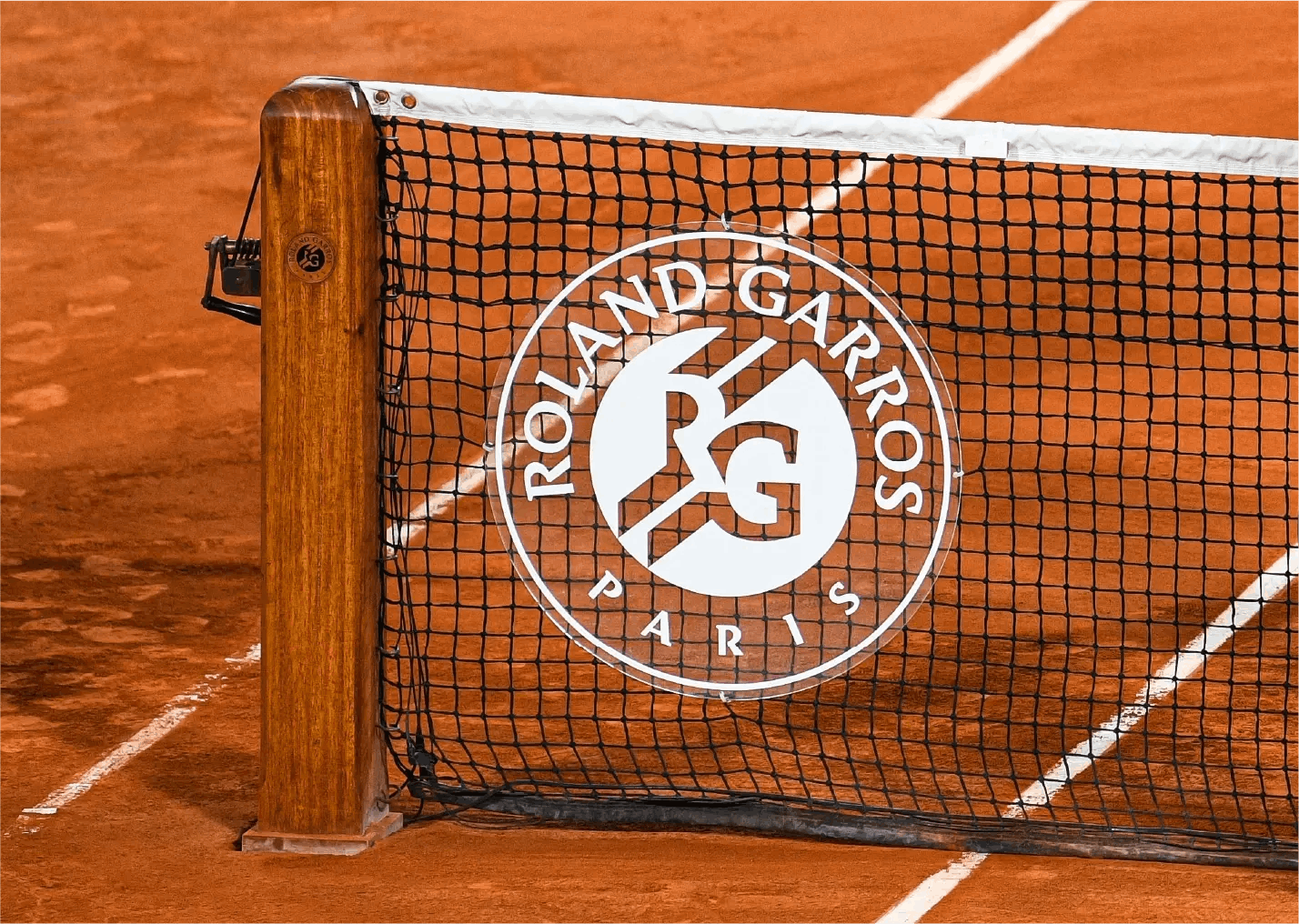
Roland Garros
Digiworld Institute
VINCI
La Centrale
Res Sportiva
CNRS

Neosoft
Ineez
Graitec
Naval