SEE
BRANDS
AIRFRANCE
AIRLIQUIDE
ALLIANZ
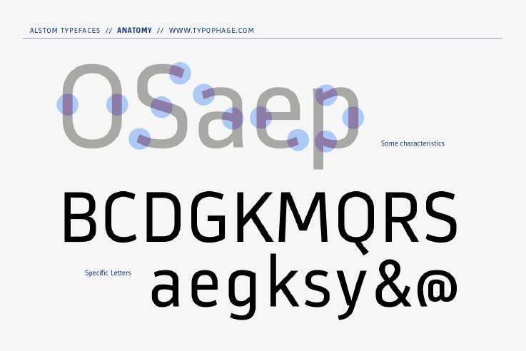
Alstom

APM

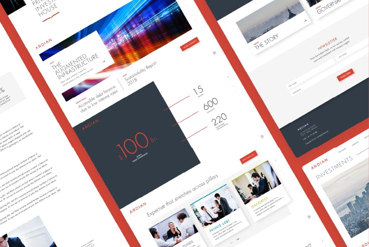
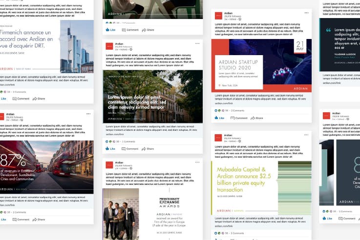
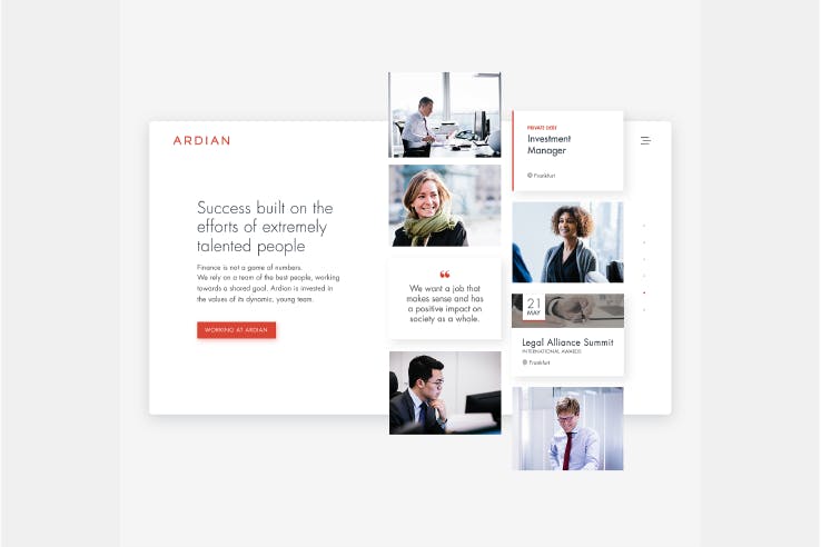
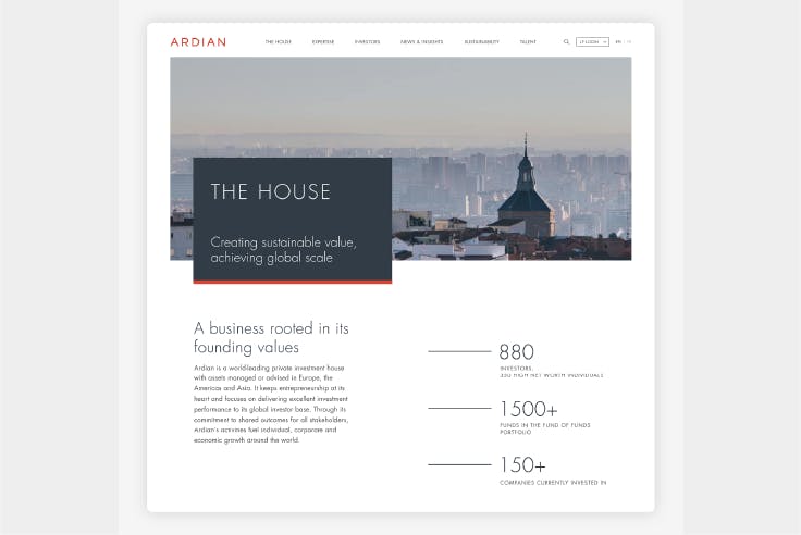
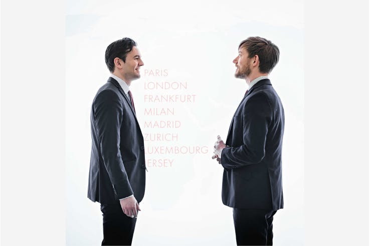
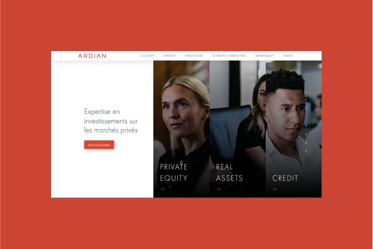
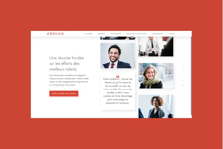
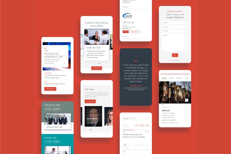
Ardian
AREVA
AUCHAN
AXA
BANQUE POPULAIRE
BNP PARIBAS
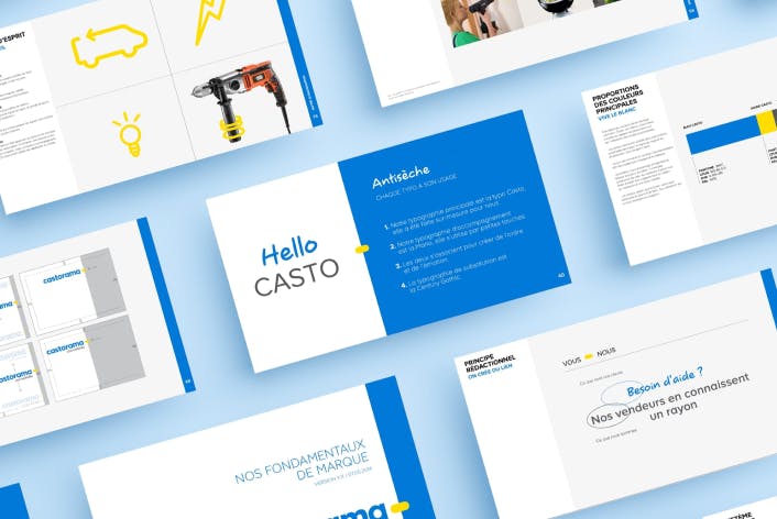
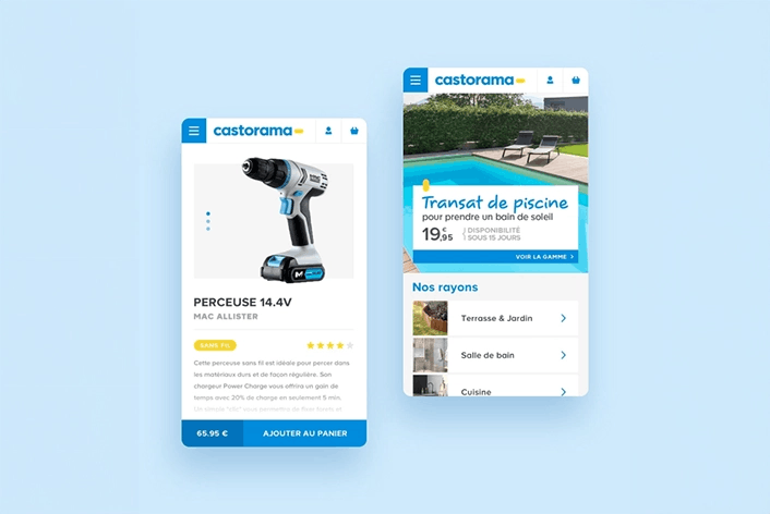
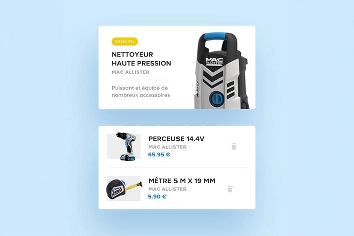
Castorama
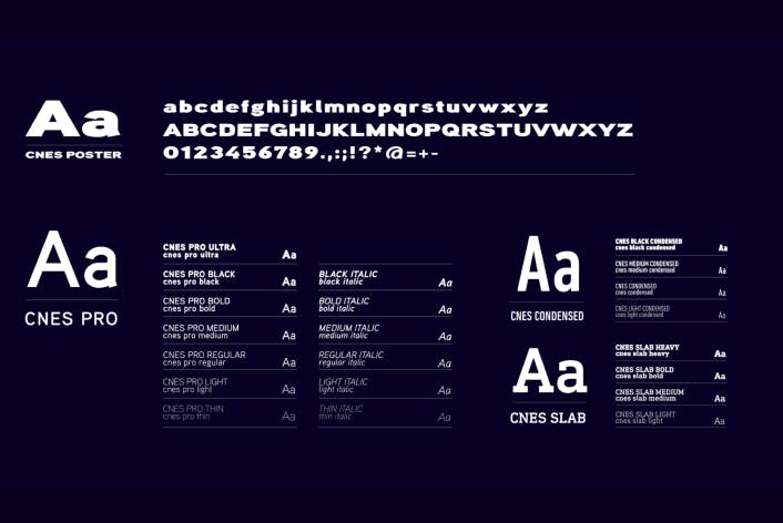
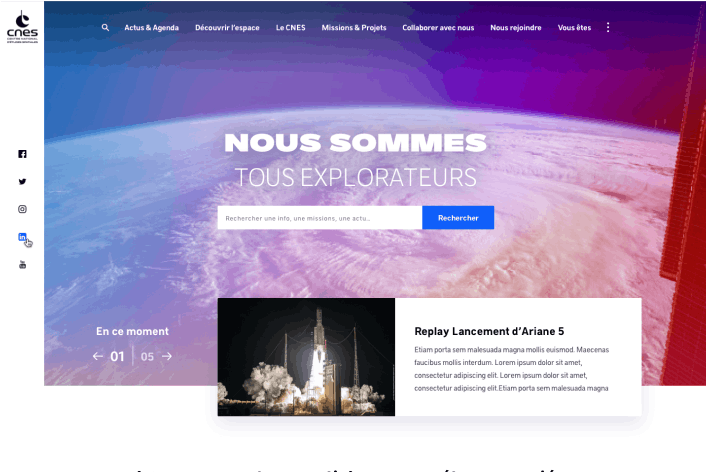
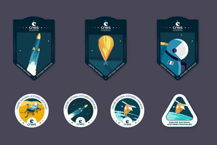
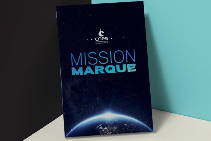
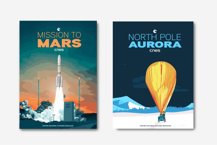
CNES
CRÉDIT MUTUEL CIC
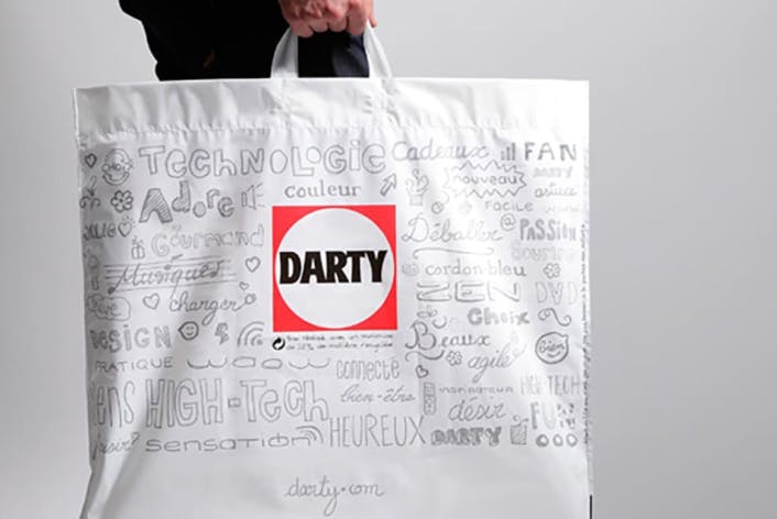
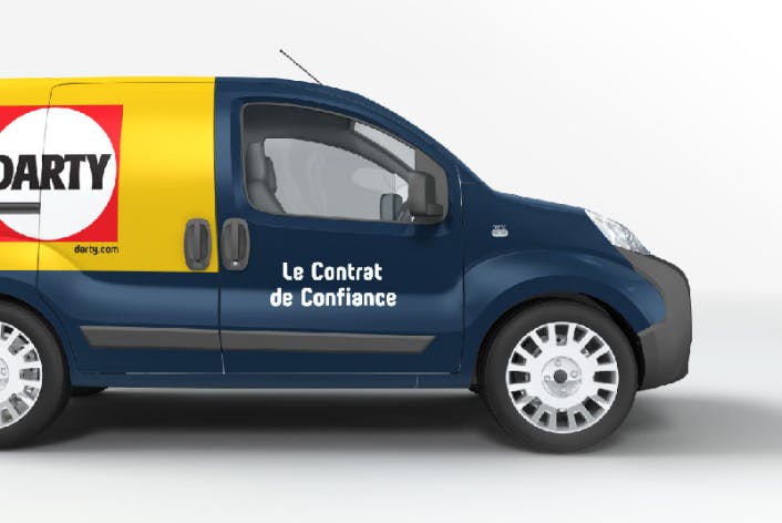
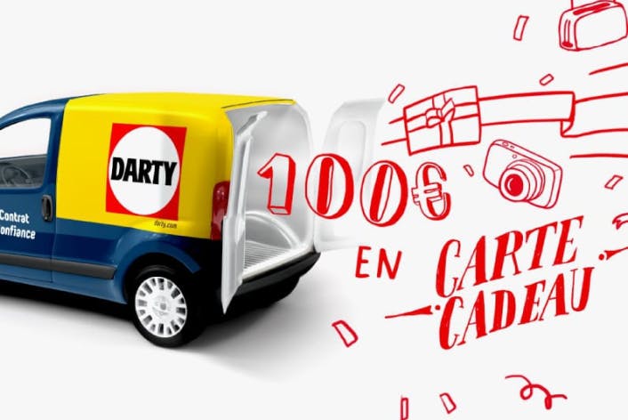
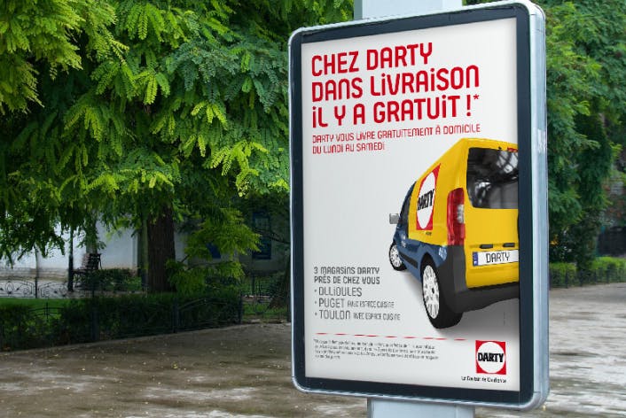
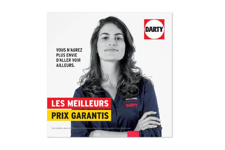
Darty
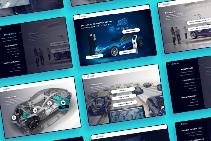
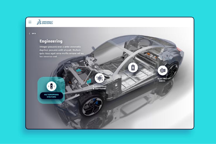
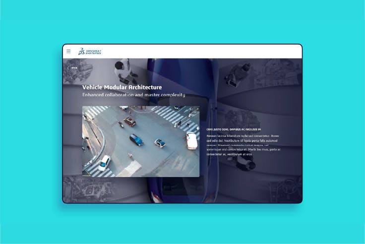
Dassault Systemes
ELIOR
EQUANS
FÉDÉRATION FRANÇAISE DE KARATÉ
FNAC (PACKAGING)
FOODCHERI
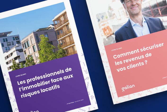
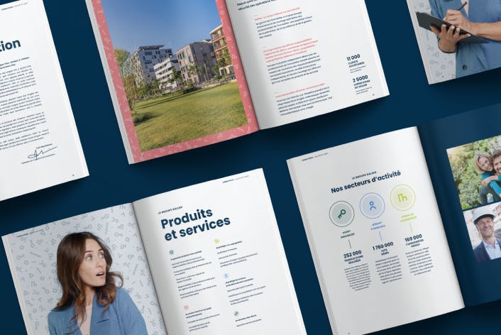
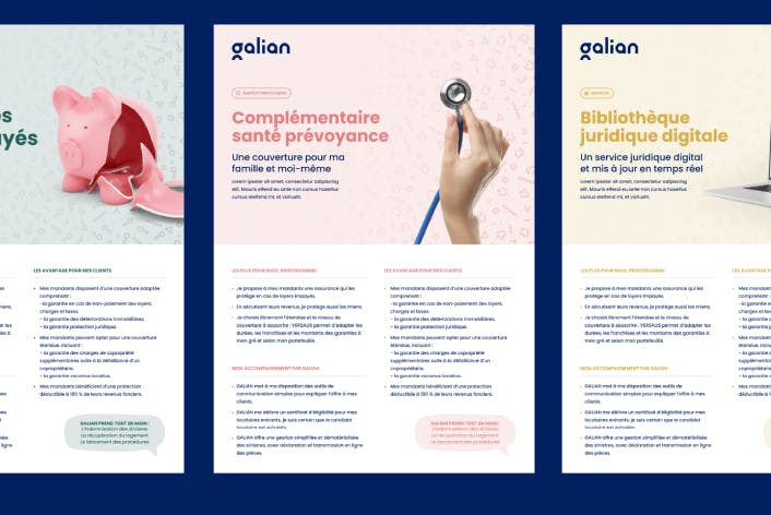
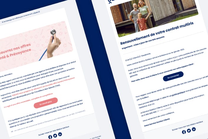
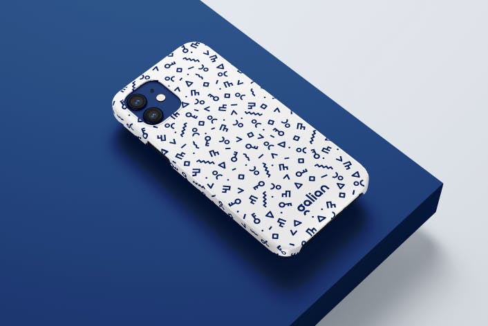
Galian
GLOBALE CHAMPIONS LEAGUE
HISTOIRE D'OR
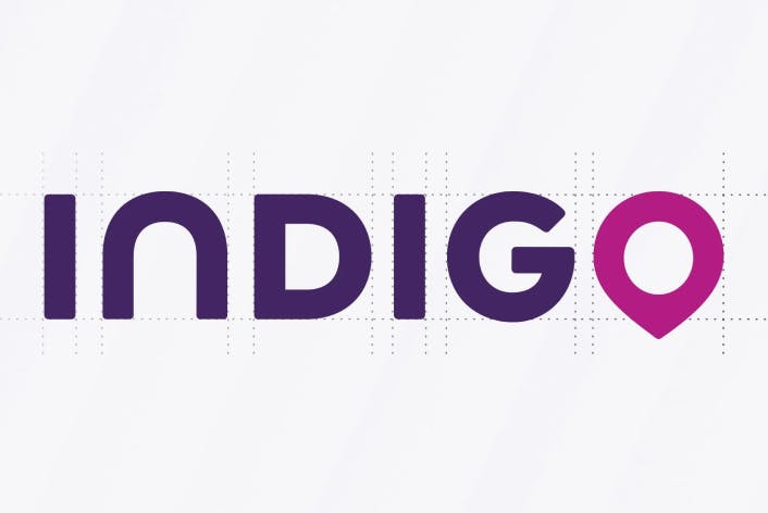
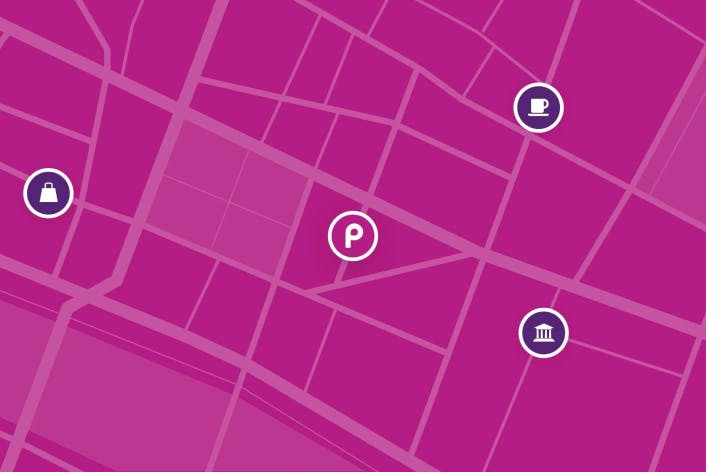
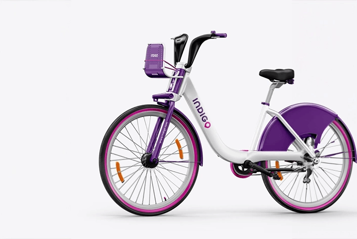
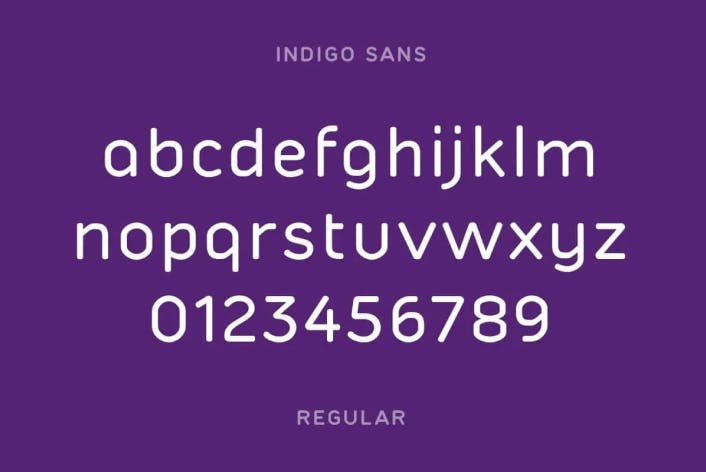
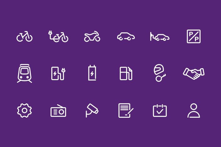
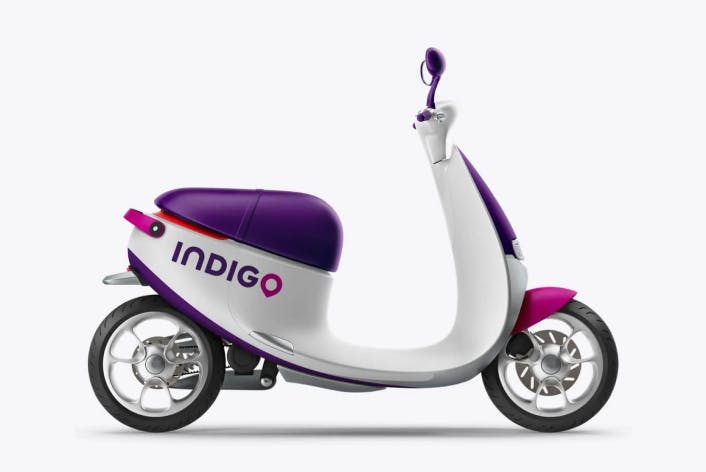
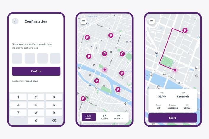
Indigo

KENZO
KEOLIS (raison d'être)
LA FRANÇAISE DES JEUX
LE GUIDE DU ROUTARD
LOISIR ENCHÈRES
Maaf
MARIGNAN
MASTERCARD
MICHELIN
NAVIRIS
NOCIBÉ
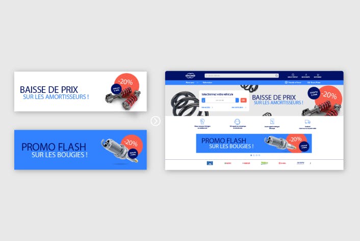
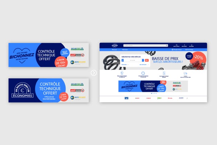
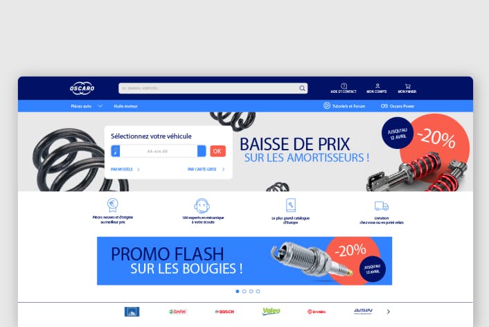
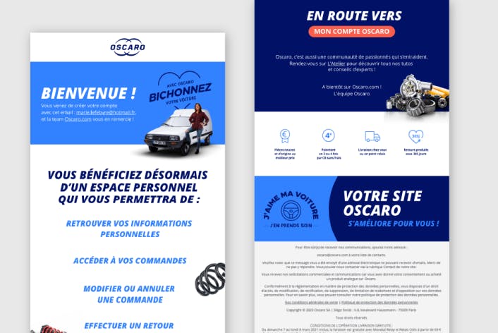
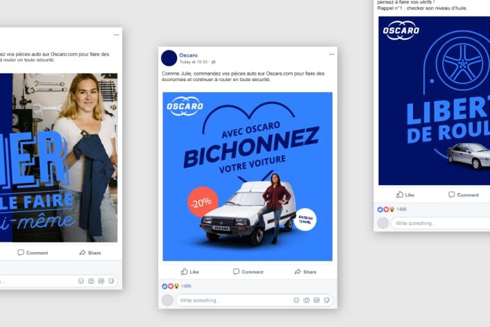
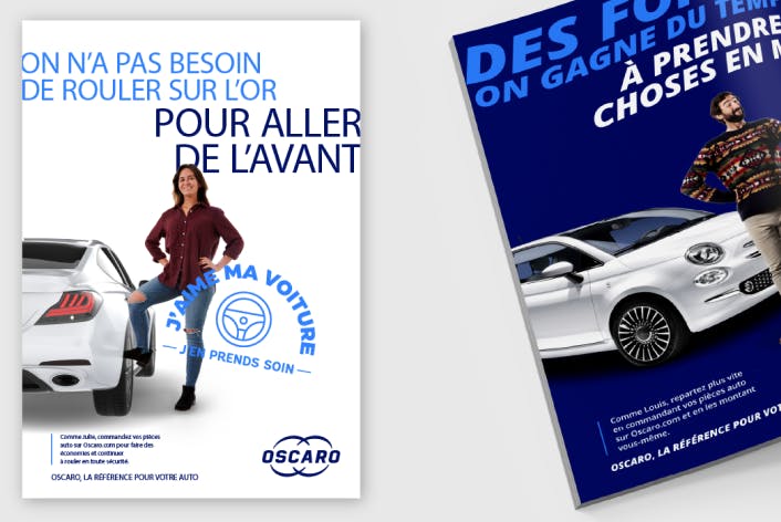
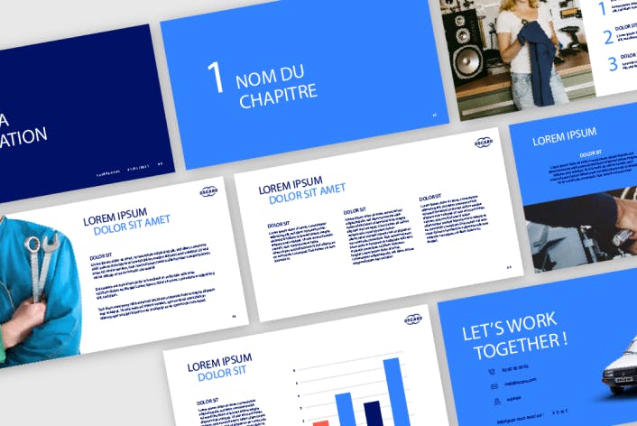
Oscaro
Paylib
PSA PEUGEOT CITROËN
Quitoque
RATP
RELAIS & CHÂTEAUX
SAINT-GOBAIN Homly You
SNCF
SOCIÉTÉ GÉNÉRALE
SOCIÉTÉ GÉNÉRALE SOBRIO
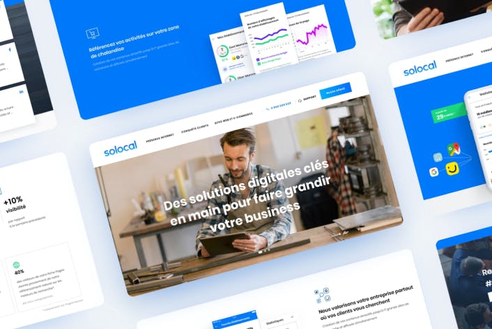
Solocal
Sopic

SQUARE HABITAT / CRÉDIT AGRICOLE
Taittinger
THALÈS
TOTAL
Ubisoft